
| 일 | 월 | 화 | 수 | 목 | 금 | 토 |
|---|---|---|---|---|---|---|
| 1 | 2 | 3 | ||||
| 4 | 5 | 6 | 7 | 8 | 9 | 10 |
| 11 | 12 | 13 | 14 | 15 | 16 | 17 |
| 18 | 19 | 20 | 21 | 22 | 23 | 24 |
| 25 | 26 | 27 | 28 | 29 | 30 | 31 |
- fragment
- error
- android aac
- 안드로이드 DB
- 앱개발
- 코틀린
- koltin
- notifyDataSetChanged 대신 사용하기
- 클린아키텍처
- 뷰모델팩토리
- Clean Architecture
- 다른버전 다운로드
- DiffUtilCallback
- 키보드 숨기기
- DI
- 어댑터 효율적으로 사용하기
- HotStream
- 안드로이드
- Kotlin
- 안드로이드 스튜디오 구버전 다운받기
- list adapter
- 계층 분리
- Android
- compose
- 화면전환
- 의존성주입
- notifyDataSetChanged 비효율
- hilt
- ColdStream
- SQLite
- Today
- Total
DoReMi
[Compose] 코드랩 따라가기 3 본문
Compose의 기본 레이아웃 | Android Developers
이 Codelab에서는 Compose에서 즉시 제공되는 컴포저블과 수정자를 통해 실제 디자인을 구현하는 방법을 알아봅니다.
developer.android.com
Material 3을 사용하는 Compose의 테마 설정 | Android Developers
이 Codelab의 목적은 새롭게 구현된 Material Design 3 및 Material You로 Jetpack Compose의 테마 설정을 보여주는 것입니다.
developer.android.com
기본 레이아웃
아이콘
TextField(
       value = "",
       onValueChange = {},
       leadingIcon = {
           Icon(
               imageVector = Icons.Default.Search,
               contentDescription = null
           )
       },
)
TextField에서 leadingIcon을 통해 맨 앞에 아이콘을 추가할 수 있다.
이미지
Image(
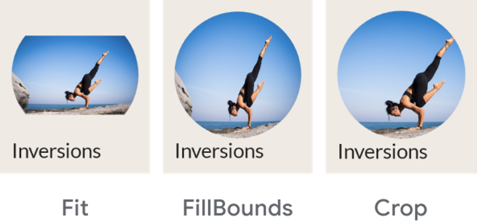
painter = painterResource(R.drawable.ab1_inversions),
contentDescription = null,
contentScale = **ContentScale**.Crop,
modifier = Modifier
.size(88.dp)
.clip(CircleShape)
)
Image의 contentScale 매개변수를 통해서 이미지의 모양을 바꿀 수 있다.
정렬 방법
상위 컨테이너의 alignment를 통해서 정렬할 수 있다.
상위 요소에서 정렬하는 경우 하위 요소가 한번에 정렬된다.
- Colum 속성
- Start
- CenterHorizontally
- End
- Row 속성
- Top
- CenterVertically
- Bottom
- Box 속성
- TopStart
- TopCenter
- TopEnd
- CenterStart
- Center
- CenterEnd
- BottomStart
- BottomCenter
- BottomEnd
Column(
       horizontalAlignment = Alignment.CenterHorizontally,
       modifier = modifier
   )
Shape
Surface(
       shape = MaterialTheme.shapes.medium,
       modifier = modifier
   )
shape = MaterialTheme.shapes.medium 를 통해서 모서리를 둥글게 할 수 있다.
아이템 간 정렬 간격
LazyRow(
       horizontalArrangement = Arrangement.spacedBy(8.dp),
       modifier = modifier
   )
Arrangement.spacedBy(8.dp), 를 통해서 아이템 간의 간격을 벌릴 수 있다.
Grid
LazyRow 에서 Grid를 사용하는 경우
spacedBy로 아이템 간의 정렬간격을 조절하고
가로 세로의 dp를 직접 정의해야한다.
LazyHorizontalGrid(
       rows = GridCells.Fixed(2),
       contentPadding = PaddingValues(horizontal = 16.dp),
       horizontalArrangement = Arrangement.spacedBy(16.dp),
       verticalArrangement = Arrangement.spacedBy(16.dp),
       modifier = modifier.height(168.dp)
   )
스크롤
Column(
       modifier.verticalScroll(rememberScrollState())
   )
을 통해서 Column을 스크롤 할 수 있음
만약 스크롤 상태를 수정해야하는 경우 ScroolState() 를 사용하면 되고
스크롤 수정이 필요 없는 경우 rememberScrollState() 를 사용하면 된다.
테마 설정
Light, Dark 모드
Color.kt
val md_theme_light_primary = Color(0xFF825500)
이러한 방식으로 색상 변수 초기화
Theme.kt
private val LightColors = lightColorScheme(
   primary = md_theme_light_primary,
)
이런식으로 lightColorScheme을 통해서 색상별로 변수 초기화
이후에 밑에 코드처럼 if문을 통해서 모드 전환
@Composable
fun AppTheme(
   useDarkTheme: Boolean = isSystemInDarkTheme(),
   content: @Composable() () -> Unit
) {
   val colors = if (!useDarkTheme) {
       LightColors
   } else {
       DarkColors
   }

   MaterialTheme(
       colorScheme = colors,
       content = content
   )
}
- useDarkTheme
이 매개변수는 isSystemInDarkTheme() 함수와 연결되어 시스템 테마 설정을 관찰하고 밝은 테마 또는 어두운 테마를 적용합니다. 앱을 밝은 테마나 어두운 테마로 수동으로 유지하려면 불리언 값을 useDarkTheme에 전달합니다.
글꼴
ui/theme - Type.kt 파일 생성
// typography 정의
val typography = Typography(
   headlineSmall = TextStyle(
       fontWeight = FontWeight.SemiBold,
       fontSize = 24.sp,
       lineHeight = 32.sp,
       letterSpacing = 0.sp
   ),
Theme.kt 파일의 AppTheme로 전달
@Composable
fun AppTheme(
   useDarkTheme: Boolean = isSystemInDarkTheme(),
   content: @Composable() () -> Unit
) {
  // dynamic theming content

   MaterialTheme(
       colorScheme = colors,
       **typography = typography,**
       content = content
   )
}
사용법
Text(
   text = email.sender.firstName,
   style = **MaterialTheme.typography.labelMedium**
)
도형
ui/theme - Shape.kt 파일을 생성
// shapes 정의
val shapes = Shapes(
   extraSmall = RoundedCornerShape(4.dp),
   small = RoundedCornerShape(8.dp),
   medium = RoundedCornerShape(16.dp),
   large = RoundedCornerShape(24.dp),
   extraLarge = RoundedCornerShape(32.dp)
)
Theme.kt파일의 AppTheme에 전달
@Composable
fun AppTheme(
   useDarkTheme: Boolean = isSystemInDarkTheme(),
   content: @Composable() () -> Unit
) {
  // dynamic theming content
   MaterialTheme(
       colorScheme = colors,
       typography = typography,
       **shapes** = **shapes**
       content = content
   )
}
사용법
Card(shape = MaterialTheme.shapes.medium) { /* card content */ }
FloatingActionButton(shape = MaterialTheme.shapes.large) { /* fab content */}
'Android > Compose' 카테고리의 다른 글
| [Compose] 코드랩 따라가기 2 (0) | 2024.03.19 |
|---|---|
| [Compose] 코드랩 따라가기 1 (0) | 2023.09.01 |
